View fullsize
View fullsize

The old terms and condition page vs. the new one (in the blue box on the right)
The existing terms and conditions page was a nightmare. I worked with the product and legal/compliance teams reduce the page from multiple paragraphs and checkboxes to a single checkbox attestation at the bottom of the application.
We had to use the existing platform, which had various technical constraints.
Lots of voices and various stakeholders wanted to contribute their ideas to the project, which made approvals difficult.
The look and feel of the application is different from other applications within the bank.
View fullsize

The old BMO deposit account application flow (mobile) with our Post-it notes
View fullsize

Some of our notes about American Express, Discover, and Citizens Access applications
Have a checklist of requirements upfront
Ask for e-mail address first
Allow customers to apply for multiple accounts at once
Cross-sell of other accounts in the application process
Have seamless online banking enrollment
Have different entry points for new and existing customers
The "best" forms were mobile-optimized and used native mobile features vs custom UI elements
Every bank handled fraud/anti-money laundering questions differently; most asked fewer questions than BMO
Content and copy is crucial to the overall usability of the flow
While some experiences were quicker and easier than others, in general there was no single "perfect" experience
Overall, the fintech applications were generally better than those of the traditional banks
View fullsize
View fullsize

Early version of the one page application approach
View fullsize

Early version of the multiple page approach
First test: 20 participants (via usertesting.com) tested the first iterations of the new application
Goal: get feedback on the IA and flow of the new application and determine if customers prefer one page or multiple page applications
Results: participants were split on one long form vs. short form (results were split 50%/50%), but they thought both applications were quick and easy
Second test: 8 participants (via usertesting.com) tested a revised and higher fidelity prototype of the application
Goal: confirm wording of anti-money laundering questions and usability of features not commonly used in the happy path scenario
Results: participants gave the application a System Usability Scale (SUS) score a 88.4 out of 100, which is far above the industry average score of 68
Average time to complete the application decreased by 90 seconds from 6 minutes to 4 minutes and 30 seconds
43% increase in deposit account openings compared to 2019
The submission rate of all deposit product applications increased by an average of 8% (average of 56% between Mar 2020-Nov 2020 vs. an average of 48% Jun 2019-Feb 2019)
View fullsize
BMO personal checking and savings account application redesign
Year of project: 2019-2020
Challenge: Decrease the time to apply for a checking or savings account, increase the amount of applications that are submitted, and create a UI that works across all deposit products (savings and checking accounts)
My role: One of two product designers working with a content strategist, a UX researcher, product owners, developers, and various stakeholders in an agile environment
Results: Decreased the average time to complete the application by 90 seconds (from 6 minutes to 4 minutes and 30 seconds) and the overall application submission rate is up by an average of 8% since launch.
Background
In 2019, the BMO Harris Bank checking and savings account applications were in desperate need of an update. Customers were dropping off on the second page of the application, the start to submit rates were low, and the experience felt disjointed. My fellow designer and I were tasked with overhauling the applications with a refreshed UI that works across all of BMO’s deposit products.

Screenshots of the existing deposit application flow
Challenges
We faced numerous challenges throughout the project and I worked with various members of the team to overcome them.
Heuristic evaluation of existing application
We printed out the current application and used to Post-it notes to point out questions we had, suggestions, or fields that should be removed from the application.
We got the product team involved at this stage so they could be a part of the design process early and help us determine which questions in the application could be removed.
Competitive analysis
During our research, we found that most banks:
Takeaways:
Link to the entire competitive analysis
Ideation
We combined all of our research, data, and best practices to come up with our ideal deposit application flow. Our goal was to reduce the amount of questions asked, the amount of time it takes to complete the application, and reduce the number of screens. The application went through at least five major iterations prior to launch.
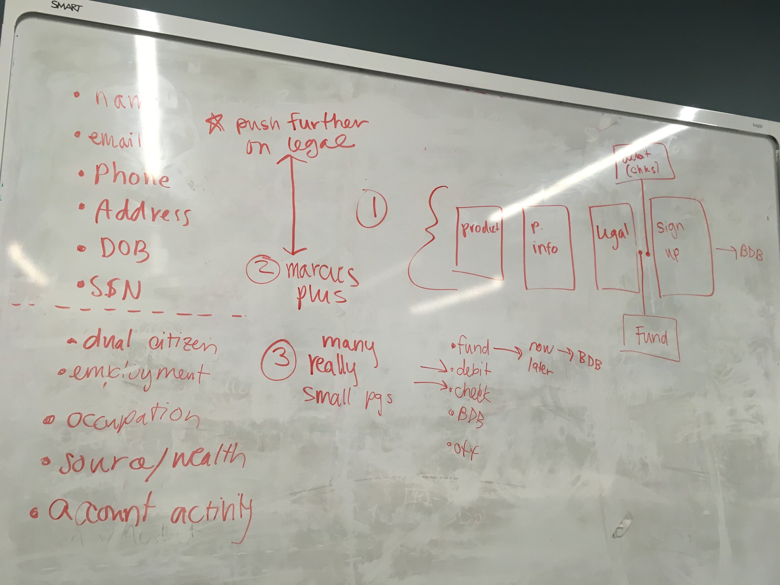
Results of a whiteboarding session with the design and product teams agreeing on the order of the questions in the application
Usability testing
We conducted two rounds of testing with our UX researcher throughout the project.
Results
The application launched in March 2020 at the beginning of the pandemic. Click this link to view the live application (click any Open Now button).
