Walgreens: MDLive refresh
Platforms: iOS & Android
Year of project: 2018
Project brief: Replace the current MDLive SDK with their API in order to provide a better user experience and have more control over the UI and flow
My role: I was the only UX designer. I worked with a content strategist, UX researcher, product owner, business analyst, and developers in a waterfall environment.
Background
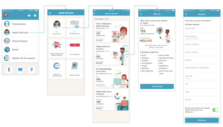
Walgreens partnered with MDLive to offer their telehealth services within the Walgreens app. The app leveraged MDLive’s SDK, which had numerous UI limitations and only worked for iOS.
Existing design review
Before I started sketching, I reviewed the current experience.


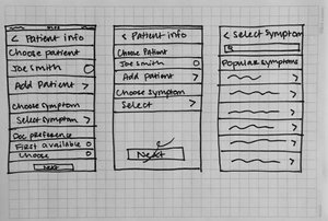
Ideation and sketching
After I reviewed the current experience, I sketched ways to shorten and reorganize the flow. I created happy path and a hierarchy of how I thought the information should be displayed within each screen.

Examples of some initial sketches:


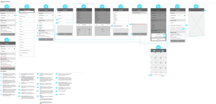
Wireframes
I wanted to shorten the flow as much as possible, but ran into some difficulty due to the amount of information that is required by MDLive.
I went through several iterations of the wires due to stakeholder feedback, discussions with my development team, and feedback from MDLive.

User testing
I worked with a UX researcher to conduct two days of in-person usability testing. We had a 10 participants compare the current experience with the new flow on iPhones.
The goal was to determine if the redesigned experience was better than the current design.

After the first day of testing, I made updates to the flow based on feedback.
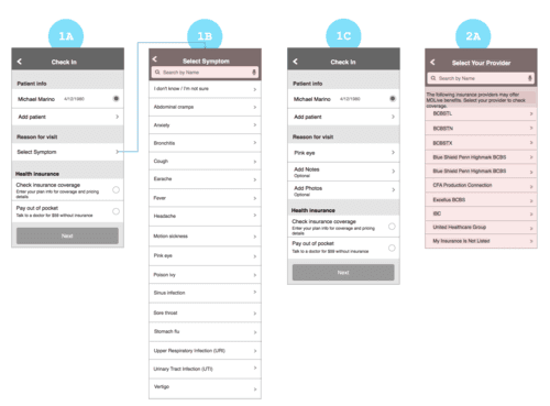
Updated the Patient Information screen
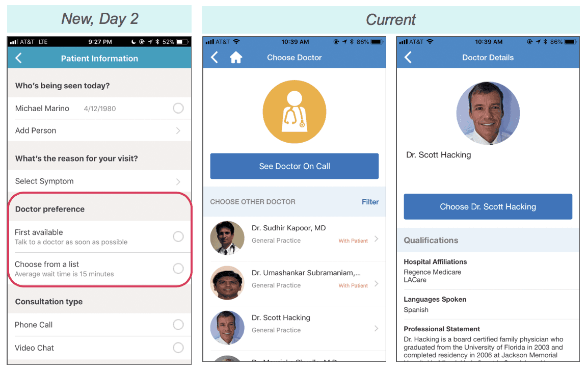
Participants liked having the patient information, symptom selection, and doctor selection on one screen. It made these steps feel shorter than in the current flow.
“I like how [the new patient info screen] is really compact; it says, name, birthdate, symptoms all on one page. [The current patient info screen] seems like a big wasted page, for what.” - Andrea
For the second day of testing I added an additional section to this screen in an effort to continue to reduce the amount of screens in the lengthy flow.
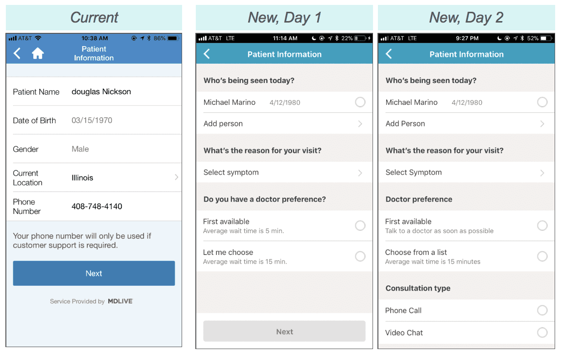
Added an additional notes column
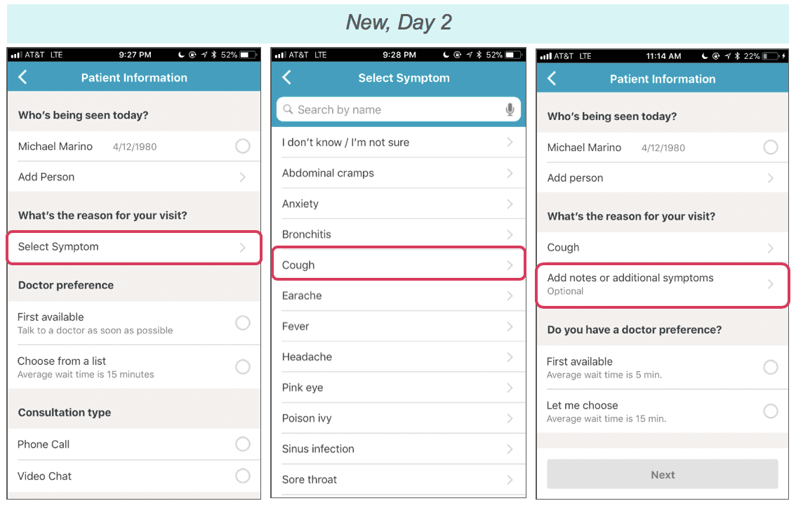
Due to API limitations, users are only able to select one symptom or “reason for visit.” Nearly every participant wanted to select multiple symptoms or share more info with the doctor, and adding this option was an appreciated solution.
“Since it doesn’t let me select multiple symptoms, I would probably select the one that’s the most bothersome, and then I would just type up a bunch of notes there.” - Gil
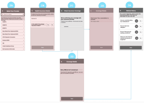
Updated the Payment Information screen

A few participants didn’t know what they were being charged for and others wanted to see confirmation of payment. I worked with the UX copywriter to make the screen more clear.
(current) “I haven’t received the service yet, so I wouldn’t expect to be charged. So I presume it would just record some kind of acknowledgement that it’s just recording my credit card information. I don’t know”
(sees new messaging) “That’s what I was complaining about earlier on the other one with the credit card, so I like the notation.” - Mike
Research findings
The redesigned experience felt easier to interact with than the existing experience.For many, the existing experience felt longer because there were more text fields.
Key findings:
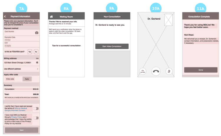
Participants weren’t sure what would happen once they entered the “Waiting Room” and were worried they’d miss the consultation if they left the screen
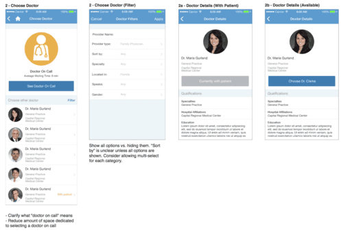
Once participants saw faces of the doctors in the UI they had a better sense what MDLive does (image on right shows new design vs. current)
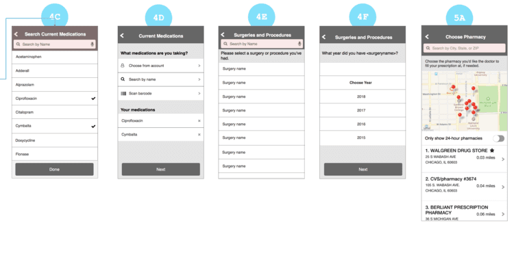
Many participants thought entering the year of a surgery was unnecessary and cumbersome
Participants didn’t like that they had to wait until the billing screen in the existing flow to learn how much their insurance would cover for the visit
Revisions
I updated the wires and adjusted the flow based on what we learned from research.
Major flow updates:
Moved “check insurance coverage” from the MDLive home screen to the check in screen so it wouldn’t be missed
Made the “choose doctor” selection its own screen so users have a clear understanding of their options and the service
Made “consultation preference” (i.e. phone call or video chat) its own screen after learning additional required fields in the API


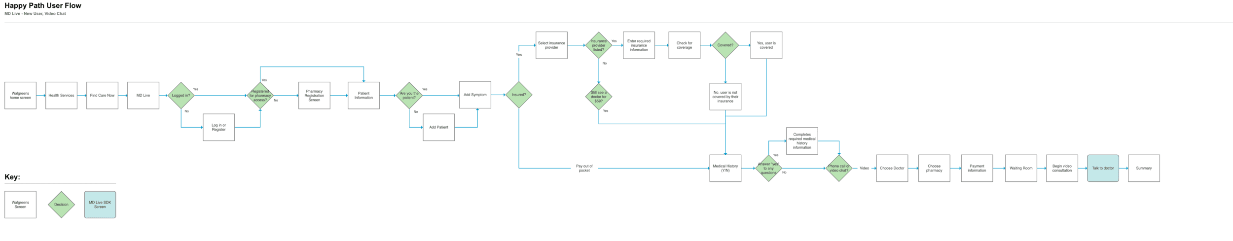
View fullsize

Original happy path for a video consultation
View fullsize
Updated happy path for a video consultation
Final experience
The happy path screens were just the tip of the iceberg. I also designed every screen new and returning users could encounter. Those screens can be found in the following links: